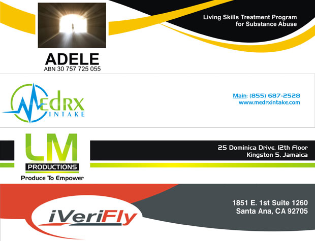
There are lots of methods for branding and we use these methods on different time and with different style. Company stationery is one of the most important and effective methods of branding which is very helpful to market any brand. From company stationery, letterhead is very important part which is link to professional people. We use it to correspond with our valuable and potential customers as well as with other companies in official corresponding therefore letterhead deserves more importance and every business owner should conscious about its design and print. In this scenario we are going to share some essentials of a letterhead design which can make any letterhead perfect. These essentials are;
Keep it Simple:
Simplicity is best and it never gets old or out of fashion as great Leonardo da Vinci said “Simplicity is the ultimate sophistication”. Therefore A simple letterhead can make all the difference to the success of your branding. It is really important that your letterhead should look great but ever designers should keep in mind that in chasing of that greatness you shouldn’t make it complicated or awkward. So always try to make it as simple as you can.
Correct Size:
We all know that its standard size is A4 or 8.5×11 and every designer should follow the role and standard size. It is possible that a designer can modify its design according to customers’ need but never go out of standard. In this standard size a designer should not cover the essential details on huge area of total space; he/she should try to leave enough blank space for writing because purpose of letterhead is corresponding not to show design.
Use Best Fonts Style:
In print media the most important thing is it font style especially stationery related stuff like business cards, letterhead, envelope etc. Therefore choosing a best font style can make any design perfect, for example if a designer created an outstanding design but he/she used a complicated and unreadable font style what you think it will be great? Answer is never. So a best and readable font style can help to create a best letterhead.
Content Elements:
The main purpose of your letterhead is to tell your customers that you are corresponding on company’s official documents other you can correspond on simple white papers. Therefore every designer should include these elements in every letterhead design
Company Name
Company Logo Design
Phone & Fax Numbers
Physical Address
Email
Website Address
These elements will help you in branding and to meet the purpose of you letterhead designing.
Use Perfect Layout:
There are lots of options in layout choosing while letterhead designing, or letterhead design Services being a designer I think it is up to designer who he/she is using this option because the ultimate purpose is to make letterhead attractive. Designer can use company address detail on top after company name or at the bottom; there is not a specific role in this scenario. I personally think that company’s contact details should be at the bottom of the letterhead.
Right Colors Combination:
In all kinds of designing colors has basic role therefore importance of colors usage is high. Right colors combination is necessary and only professional, educated and experienced designers know the meanings of colors. Designers should follow the company’s colors for example if company’s logo has red and black color you should use both these colors while letterhead designing and never go out of company’s colors because it can ruin your design and it will look awkward.
Don’t Forget the Purpose – Branding:
Ultimate purpose of letterhead head is branding therefore designers should keep in mind its purpose and should put all the basic and essential details about company and brand name because if a letterhead doesn’t have basic details about company or brand how a viewer will get knowledge about a particular brand? So never forget about the purpose of letterhead which is “branding”.
Quality Printing:
Finally you reached at the most important part of a perfect letterhead which is about the quality of its printing material. If a design is outstanding and absolutely fine but it is not printed on a quality paper and its printing material is not perfect as it should be, how you can say it is a perfect letterhead? Therefore every business owner should select a best and professional printing service company. Viewers and receivers of your letterhead will get its hard copy therefore its printing quality should be outstanding.
At Kool Design Maker, we always keep in mind all these essential steps while designing and printing of your company’s letterhead, because we know the meaning of perfection and we care about your business, time and money. Therefore we never waste our customers’ time and money and we deliver best in affordable rates with 100% satisfaction. So if you are looking for a best letterhead designing & printing company www.kooldesignmaker.com should be your first priority.


