If you are a graphic designer, you should know how to design effective display signs and billboards. There are few differences in designing small banners and display signs. The major difference is scale. The display signs are a lot larger in size than the standard web banners. Other factors to focus on during designing signage are display location, typography; color scheme, contrast and material the sign will be printed on.

Keeping in mind all these factors will make a better sign design.
1. Consider Size and Scale
A sign is among the largest things a graphic designer ever designs. Think of it like a big thing. A standard business card is 3.5 inches by 2 inches in size; a standard yard sign is 24 inches by 18 inches and a standard bulletin billboard is 14 feet high by 48 feet wide.
Size and scale are interesting challenges for a graphic designer. Signs have to be easily read and understood completely from a distance, often by people who only have a few seconds to look in that direction. So everything should be larger in size and simple for clear visibility.
2. Use Eye-Catching Colors and Graphics
Color is one of the most important factors that need attention when working on a sign project. You should focus on it with following two things in mind:
- Contrast and visibility
- Branding and identity
Generally color and graphics should be bright and saturated. Try to avoid light colors. Never use colors that have a lot of contrast, especially between the images and background.
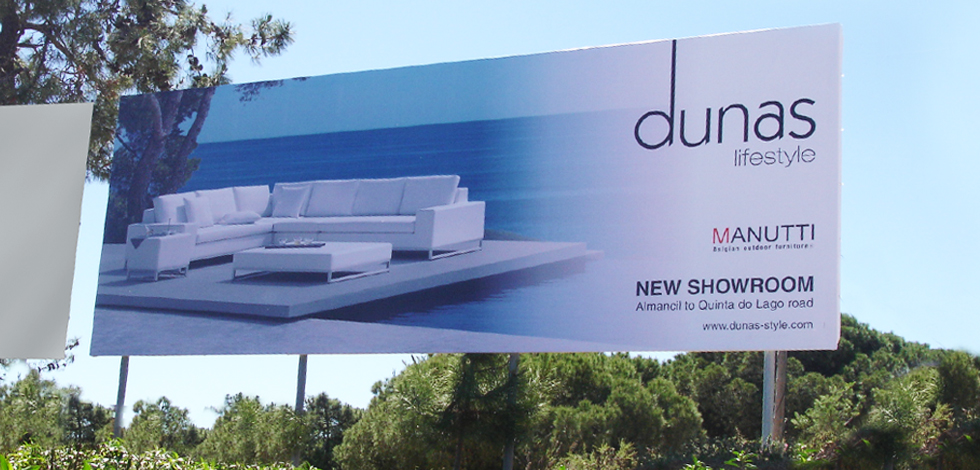
The main purpose of signs is to catch someone’s attention in first look; you need to go big in terms of graphics and images. Also think about the location where the sign will be located. Just suppose if the sign is placed in between green tress and the theme color of your sign is also green, how visible will it really be to people?
You should plan for color scheme, keeping in mind the placement location.
3. Use Effective Contrast
The contrast is also an important part of any graphics design project, you should use such a contrast that gains someone’s attention I a couple of seconds. Every focal point should be clearly distinguishable.
There is no standard set of color combinations for display signs and contrast, given below are a few that are majorly used in signage being easy to read from a distance:
- Red and white
- Red and yellow
- Green and white
- Blue and white
- Blue and yellow
- Black and white
- Black and yellow
You can create even more contrast in the sign design by adding a boarder in your design. A simple, thick black or white border encasing the sign image can help in making it more prominent from almost any other condition.
4. Consider Location
Think about the placement of the sign before designing. If you do not know the exact physical location of the signage, think about it in terms of primary placement.
You need to focus on following questions before designing:
Will the design be featured in the sky, such as a billboard?
Will the design be featured on the ground, such as a yard sign?
Will the design be featured on a moving vehicle, such as a wrap?
Will it be displayed indoors?
Do the sign have a border?
Then ask from client about the placement location of the sign. It will help you in selecting a color pattern that contrasts with the environment.
5. Use Simple Typography
When it comes to typography, keep it simple and big. Use the standard lettering in terms to 10 to 100. That means 10 inches of letter height for every 100 feet of visibility.
Do consider the total number of words. Use short and simple message. Never use a message containing more than 15 words. The standard formula used is the 3 by 5 rule. It can be defined in following two ways:
- Five lines of text, up to three words each, or
- Three lines of text, up to five words each
Consider using bold typography. Bold lettering helps in readability from a distance. Use spaces where required, it will minimize confusion in reading from a distance.
6. Printing Material
Printing material impacts on every decision you make in sign designing. Sign materials are often categorized into two basic categories based on location (indoor vs. outdoor). Most of the sign designs are printed on a vinyl banner, billboard, magnetic and corrugated plastic. Location of sign placement also impacts on printing material.
Ask from client about the printing material in the start of the project; get the specs, and ask about file formats. Getting detailed specs of projects at the start will save a lot of headache in the end.
Conclusion
Consider your sign design project like almost any other project, and if you are working on this kind for the first time, ask plenty of questions from the client before you get started. Sign design is not tricky; it required a high contrast, simple typography and visible to read from long distances.


