Tag Archives: best website designs

10 Best Handwriting Fonts for Graphic Designers

Selection of attractive fonts during graphics design process is very crucial for every graphic designer. Fonts play a very important role in designing of an attractive and eye-catching banner or web design project.

At kooldesignmaker.com, we have designed many attractive banner designs, web designs, Facebook cover designs, YouTube cover designs and business card designs using attractive handwritten fonts.

In this blog post, I’m writing about 10 best free handwriting fonts that will help you in making your designs creative and eye-catching. These fonts are free for use in any design project.

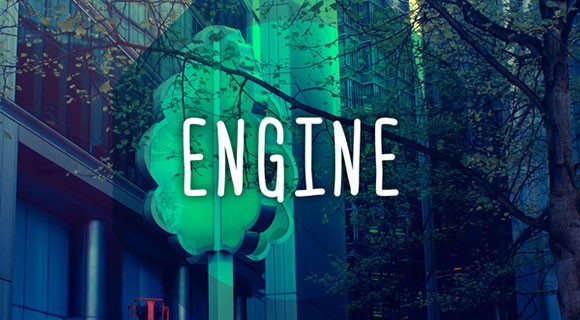
1. Engine

Engine font was created by a designer Ferdie Balderas. It is available in Regular and Italic styles and can be used in capital and lower-case letters. This font is available in four languages including English, Spanish, French and Polish.

Also, Visit [..banner ad design…]
10 Best Handwriting Fonts for Graphic Designers-engine

2.Fofer

Fofer font was created by Mousse Creative. Fofer gives a personal style to your designs with its natural design. It is available free for download.
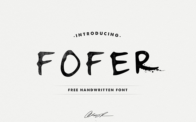
10 Best Handwriting Fonts for Graphic Designers-fofer

3. California Sans

California Sans is a handwriting font, created by Noe Araujo. It is an easy reading text font and mostly used for headlines. This font is available for free download, including upper and lower case letters with some special characters and numbers.

10 Best Handwriting Fonts for Graphic Designers-california

4. Ruffle Beauty

Ruffle Beauty is a fun handwriting font, developed by Anis Iday. This font is available for both personal and commercial use. It is ideal for poster designs.

10 Best Handwriting Fonts for Graphic Designers-ruffle beauty

5. Swissblnk Monthoers

Swissblnk Monthoers is a modern handwriting vintage display font type, which combines classic and modern typography styles.

10 Best Handwriting Fonts for Graphic Designers-Swissblnk Monthoers

6. Daniel

Daniel is one of my favorite handwriting fonts developed by designer Daniel Midgley. Available for personal and commercial use, can be downloaded for free. It comes with a full set of lower and upper case, special characters and numbers.

10 Best Handwriting Fonts for Graphic Designers-Daniel

7. Journal

The Journal is a free handwriting font developed by Fontourist. It supports more than 50 languages. Can be downloaded for free.

10 Best Handwriting Fonts for Graphic Designers-Journal

8. Fabfelt Script

Fabfelt Script was developed by a french graphic designer Fabien Despinoy. His comments about this font are “I tried to design a handwritten typeface without graininess, which is natural and a little retro”.
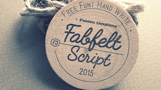
10 Best Handwriting Fonts for Graphic Designers-Fabfelt Script

9. Linny

Linny is a handwriting font, created by Maya aka Linny. This is actually her self hand-writing style which later was developed as a font. It is now available for both personal and commercial use. It comes with a complete set of upper and lower case letters.
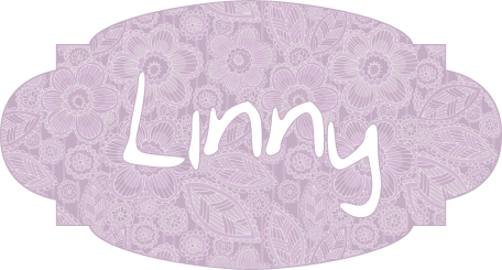
10 Best Handwriting Fonts for Graphic Designers-linny

10. Architect’s Daughter

Architect’s Daughter is a font developed was Kimberly Geswein. This was actually a self hand-writing style of the daughter of an architect. It is based on the style of daily handwriting. banner ad design
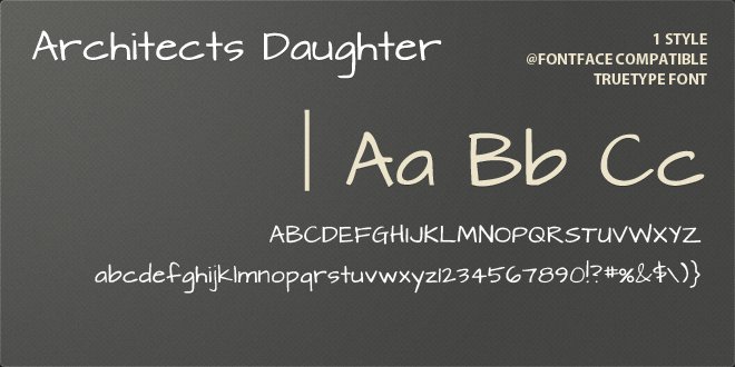
10 Best Handwriting Fonts for Graphic Designers-Architect's Daughter

Tagged , , , , , , , , , , , , | Comment

5 Tips for a Professional Website Design

Just like fashion industry, Static website designs  are constantly changing with trends and technology coming and going. When we talk about creating a professional and attractive website, we will always do best to keep everything up to date. After all, when we go for an interview, we put the best dress to look best.

print_shop web_design

Given below are 5 web design tips to keep in mind:

Keep it Simple and Clean

These days everyone likes organized things. Excessive use of Ads, icons, banners, signs, badges, buttons, pop-ups, and so on – sometimes it can all make a bad impression. Try to give your site visitors a break from all the clutter and noise. Using things like white space and flat design can make good impact on your site visitors. Keep everything simple with your most important content spotlighted.

Web Content

Web content is completely different from writing for print. Home page will be the main focus of visitors. You need to place the main content about your services at the home page, so that visitor finds his desired item quickly, but provide enough information for those who want to read complete details about the service or product.

Fold Design

The ‘Above the fold’ section requires more design attention, as every visitor first of all looks at the folder section. If your fold section is not interesting or does not provides required information, the visitor will leave your website from the first page that will increase the bounce rate. Make fold section eye-catching and informative that it creates visitor’s interest in exploring your web.

Page Navigation

Your website is useless if the visitor can’t find hid desired page. Use clear, direct and easy to use navigation on your web pages. And if you have one long page website then use anchor links to help visitors find their way on the page.

Use Small Images and Sprites

Good web designers  or Static website designs use small images in the website, as they are easy to download that improves load time of web page. It’s not okay to take a photograph and upload it to your website without re-sizing it and optimizing it to be as small as possible.

CSS sprites helps a lot in speeding up site images. If you are using a lot of images across different pages on your site, you should use CSS sprites to cache the images of website so that they don’t download again on visiting next page.

Tagged , , , , , , , , , , , , , , , , , , , , , , , | Comment

What Kind of Web Hosting Will be Perfect for You

If you want to run an online business smoothly and effectively, you need to get reliable hosting for your website. For a successful online business, getting good web hosting service is also important along with having an attractive logo design and web design.

Selecting the best web host requires a lot of research, since there are many options available in the market. Several factors need to be evaluated before making a final decision. It’s important to completely  understand the nature of the website, expected traffic and the available budget.

logo design web-hosting

There are following four types of hosting options available:

  • Free Hosting
  • Shared Hosting
  • Collocated Hosting
  • Dedicated Hosting

Free Hosting

Different companies offer free hosting plan for the first year, but in the world of free hosting, the connection can be slow, websites remain down most of the times and unwanted advertisements are added to your website. If you want to work professionally then I’ll suggest you to avoid free hosting plans. Free hosting is good only if you want to create a website for fun.

Shared Hosting

Shared hosting means that the bandwidth will be divided with other users on that server. This involves sharing of all of the software applications and the physical server. In some cases, shared hosting is affordable because the actual cost to operate a hosting server is divided between multiple users. If you want to place huge data on a website and you are expecting high traffic, then shared hosting will be not perfect for you.

Collocated Hosting

Collocated hosting means business owners purchase their own server that is placed within the facilities of the web hosting company. One major benefit of collocated hosting is that business owners are able to install applications and scripts as needed. Business owners are completely responsible for the server.

Dedicated Hosting

Dedicated hosting means the companies will have the server all to themselves and dedicated for their website. This gives them faster performance because all the resources of the server are dedicated for their website. Dedicated hosting is best for big companies because it is more expensive than all other plans.

What Do You Need to Know?

You must have complete knowledge of requirements before making the final decision for purchasing a web hosting service. Basically, you need to focus on following questions before making any decisions:

What type of website needs to be designed?

Will the website need special software?

Are Windows applications needed?

How much space will be required?

What is the desired amount of traffic?

Furthermore, it’s very important to know the reliability of the web host chosen. A website that remains down will lose a lot of potential customers and  visitors will become frustrated if they constantly find your website in not responding state.

For business owners that are new to the Web World, I’ll suggest them to start with a reputable shared hosting from a reputable company. It will be easy for them to maintain and it’s affordable also. Additionally, upgrading to a VPS or dedicated server is always a possibility is needed.

Tagged , , , , , , , , , , , , | Comment

6 Tips To Become A Good Web Designer

It is very difficult for a single web designer to lead a project in the right direction with creative ideas. Successful web designers learn from other people’s experience and don’t rely solely upon their own skills and efforts. This is the time of competition, so you need to keep updating your knowledge and skills with industry trends.

logo design company

If you want to be a great web designer, you need to improve your designing skills. It doesn’t matter whether you are an experienced web designer or you just have started discovering this field; you just need to adopt following 6 tips to succeed in this category:

1. Focus on the Main Idea

The best work is done only if the team completely understands the main concept and story behind the final product. When you are able to pick up the main idea of the story, the design will reflect your skills. You need to learn as much as you can about the project before you even start to sketch a sample of the design.

2. Watch and Read Tutorials

Tutorials are your best trainers. Graphics Designers and Web designers always have to learn new things. You can never succeed if you don’t learn the latest industry trends. Nothing is good enough in the web designing field. Learn the latest things and try some new ideas in your designs. Make a schedule of reading new tutorials each week. Remember, reading is just not enough, you will have to practice a lot to master your new skills. Make sure to have complete expertise in new skills you learn.

Make a habit to read blogs! They give you ideas, tutorials, insights, and inspiration that can turn you into a better web designer!

3.Use a Sketchbook

The sketchbook is the basic tool that is used by every designer. When you need to work on a new idea, you just pick up your sketchbook and start designing as you plan. In today’s world, Laptops with touchscreens and Tablets are a good source for making a sketch. You will find interesting apps for making sketches. This technique will improve your skills, so the end result of the project will be more effective.

4. Get Organized

Organization of your project tasks and items on your work table will help you feel comfortable and relaxed in your working area and will help you work more efficiently and smoothly. It will give you extra time to think about new idea, work and focus on the job.

5. Use High-quality Images

Any low quality image will make your design look unprofessional. You can easily access high-quality images from the internet and they are absolutely free of cost. You can also purchase desired images from different online portals. You can either hire a professional photographer for the real images that you need for your project.

6. Take Care of The ‘Above the fold’ Section

The website’s section that is visible without scrolling down is called the ‘above the fold section’. You need to invest tons of effort in the design of this section if you want to use its entire potential. You want maximum exposure of the main services and the calls to action for grabbing the visitor’s attention.

The Recipe for Success

Consistency is the recipe for success. Web design is a flexible field with new things to learn and experience. These 6 tips above will help you with the starting point of your project.

Tagged , , , , , , , , , , , , , , , | Comment

Things to Consider before Hiring a Graphics/Web Design Company

Preparing necessary things before you even start getting quotes for your next project is a wise approach that helps in speeding up the process.  It also gives you a much better idea about what it is exactly that you want. If you know well what should be the finishing state of your project, this will give the selected graphics/web design company a much better idea.

logo design

You need to consider following things before hiring a graphics/web design company or resource person:

Domain Name of Your Online Business

The domain name gives a clear idea of your products and services to listeners and visitors. It is a good idea to do some keyword research before buying a domain name for your online business. You may use Google Keyword Planner tool to find out the high competitive keywords related to your products and services.

Logo Design

Having an attractive and creative logo design has become the need in the success of any online business. I would recommend you to hire a professional logo design company for getting ideas about the design of your logo. Your company’s logo is very important for branding your business and it should be creative and of a very high-quality. Avoid using clip arts in logo design, it should be designed from scratch and match your business.

Resources for the project

It is common sense that no one can build a house without bricks, similarly no one can succeed in online business without having a good website design, required images, detailed content, the latest products, banner ads, email addresses and all other things required for a successful website design process. If you want the website design project to run fast and smoothly, I’ll recommend completing all helping material for giving to the website design company. Most of the professional website design companies will give you a list of required things.

Available Budget

During the research process of finding the best graphics/web design company, you might find less-experienced and unprofessional graphics/web design companies offering you services at very low rates. Such companies tend to work slower and produce undesired results. That wastes your precious time and money as well. Professional graphics/web design company charges higher rates, but they need less direction and work more efficiently. Such companies have strong relationships with industry experts and can lead your project in the right direction and produces extraordinary results. I’ll recommend going for the best graphics/web design company without worrying about what they charge. Don’t forget Quality is not cheap.

Tagged , , , , , , , , , , , , , , , , , , | Comment

8 Tips to Make Your Website Design Attractive

In today’s world, online presence of businesses has become very important for the success. The website is the very basic tool for making online presence. Many business owners do not pay attention to the way their Static website designs – and this badly affects their progress.

Website Design, Logo Design

Let’s have a look at 8 tips to make your website look attractive.

1. Use Eye-Catching Logo Design

A logo is the identity of your business. An attractive logo design plays a good role in the overall look and feel of the website. If you are using a dull logo design, consult any professional logo creator company to get a fresh looking and business relevant logo.

2. Compatibility

Theme of your website should be related to the products or services you are selling. For instance, if you’re a company that offers landscaping services, it would be a good idea to use some nature related background and banner images. It wouldn’t make sense to use a formal website design since it doesn’t really match the theme of what you’re offering.

3. Use Attractive Color Schemes

Always use attractive and suitable background colors to make your content easily readable. The very common practice in website design world is to use black text on a white background. Light background with dark color text will help the visitor to check complete items on the page.

4. Brand Yourself

Are you using a business logo for your website? If not, you should get a logo that represents the nature of your business. These days, it’s quite easy to get a decent looking custom logo design in very low price. A logo is the identity of your business; it will make your visitors to remember you.

5. Make the Content Reader-Friendly

Visitors often don’t spend time in reading the complete content of your website. Most of the visitors just scan for the keywords that are relevant to what they’re looking for. So it’s very important to use italicized, bolded, and underlined font for main keywords. Moreover, when writing about the packages and the benefits of your company, use bullet points to look cleaner and nicer.

6. Make Sure that it Loads Fast

One of the biggest problems with websites is their long load time. Most of the websites often take more than 20 seconds to load. By that time, the visitor closes the tab and leaves your website without viewing. Make sure that your website loads within 10 seconds. Get the help of any professional Static website designs company for removing bulky graphics and other HTML improvements.

7. Make Your Website Easy to Navigate

One thing that annoys visitor is not being able to easily navigate your website. If they can’t find their desired page, then you will never get useful results from your web. Make sure that you provide direct links of your service pages on the home page. Statistics show that 50% of visitors leave a website after their 1st click. It happens when their desired page is placed 5 pages away from the home page.

8. Avoid Unnecessary Pop-Ups

Pop-ups are a great way to show some special deal or text to a visitor that they otherwise would have missed. But the excessive and unnecessary use of pop-ups can actually be quite annoying. If you want to use pop-ups, you need to consider following points:

  • Make sure to display a prominent “close” button for visitors to leave the pop-up.
  • Make sure that your pop-up content is relevant to your website.

If you don’t provide a “close” button on the pop-up or the content of pop-up is not relevant to a website, the visitors may get frustrated that they never come back!

Tagged , , , , , , , , , , , | Comment