Tag Archives: website design services

10 Do’s And Dont’s Of Effective Web Design

Everyone related with web design world must be aware that the main purpose of create a website is – SALES! All the efforts made and tools used are necessary to bring potential visitors to your website. Given below are 10 most important DO’s and Don’t s for an effective Static website design
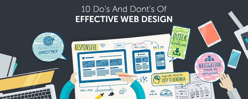
10-Do’s-And-Dont’s-Of-Effective-Web-Design

DO’s – Good For Website Success

DON’Ts – Can Be Harmful for your business


1. Use The Best Color Scheme

Bright and loud colors are never admired for corporate websites. These are good for gaming and casino sites. Always keep in mind the mindset of your readers and their emotions – e.g., a hospital site will never have animated items and bright colors but usually has a light decent color scheme.

2. Easy Navigation

Ensure that your website is easy to navigate. Visitors are not going to spend hours in searching or locating or even trying to figure out what you want to say. Using pull quotes, images and block quotes are recommended. Html tags are also important since they focus on important sections of the web page.

3. Pages Structured

Properly manage all the pages of website. Use grid layout system which helps to store all information in structures and the format is quite easy to follow too.

4. Copywriting

Content does matter a lot. It needs to be easy to understand, to the point and meaningful. Selecting catchy headlines, attractive content and right words can be a boost to any website.

5. Focus To Important Things

Are you making a corporate website or an online shopping store? Focus and display the core items at the home page and use suitable calls to actions for inner pages. Bloggers can focus on tutorials or free e-books to get attention of visitors.

6. Placing Boxes Everywhere

Never use too many boxes everywhere. Boxes in different sizes and without any alignment can be confusing to your visitor.

7. Irrelevant Ads

Too many and irrelevant ads in any website can be really annoying for visitors. If visitors get to see irrelevant or too many ads in a website, they are surely going to leave the website to never come back again. It is a fact that everyone uses ads to make money but ads stuffing can be a real problem.

8. Writing Long Content

Never write too long content on site pages. The average content length of a page should be 500 to 1000 words. Blog articles or posts which are lengthy and without any paragraph breaks are never liked by readers. It is highly recommended to use short and crisp paragraphs with catchy headings which convey meaning easily.

9. Too Many Images

Plenty of images in your website are certainly going to make your website load slowly. Your visitors will quickly move away.

10. Keyword Stuffing

Google and your visitors don’t like your website to be too much keywords stuffed. A 500 word article with 20-30% keywords will make a poor read and your site will be penalized too by Google. Stay away from it and use only 2-3% keyword density.

Kool Design Maker is the expert Web Design Company in USA offering graphics designingflyer designing, web design, Static website design  and printing services. Visit Us NOW any design or development project.

Tagged , , , , , , , , , , , , , , , , , , , | Comment

2016-2017 Web Design Trends Predictions

We are in 5th month of 2016, what do you think will happen this year in web design works? We have seen a lot of developments in web design during 2015 and in the first 5 months of 2016, let’s talk about some of the hot trends that are supposed to drive the web design industry in near future. One of the main changes that we’ve seen in 2015 and 2016 is the adaptation of mobile responsive websites. I’m listing down few key trends that are likely to change the web designs in 2016-2017.

2016-web-design-trends

1. Full Width and Large Homepages

What do you think about the importance of homepages? The trend to have full-width and large home pages is going to rule the industry and single page websites are replacing the standard grid type websites. Large homepages became a trend since quite some time and the trend is supposed to continue in current and the coming years as well. Single and large home pages website have large navigation that helps in quicker analysis of website.


2. Unique Web Design Ideas

Unique web design idea are very important standing out from competitors. Websites involving unique layouts and storyboards complement the company’s image. Website owners have realized that they have to adopt unique marketing items to compete with their competitors. Thinking outside the box is very necessary these days, if you do not adopt something unique and different you will not be able to save yourself in the web design business.


3. Material Design And Flat Design

You will see an intense focus on flat design in 2016 and 2017. There will be full-width slideshows, rich loading galleries and animations as well.

As Google now prefers fast loading websites in top rankings of organic search results, more website owners will be focusing reducing the load speed time of their websites. The best method for reducing web page load time is using tiles when possible.


4. Video Marketing

Building an attractive website is just not enough. Content is the king for driving and engaging customers, but it isn’t the only one key player. Websites that have useful videos will be able to attract more visitors than normal blog posts as videos are more engaging. Embedding short videos in websites is becoming highly popular these days and it’s an effective way to deliver a message to the audience.


5. Use of Widgets

If you are using WordPress for your site, you will find thousands of widgets at WordPress website. You can show different useful widgets at the sidebar of your website that may be Facebook widget, twitter widget or recent posts widget. Widgets can significantly enhance the user experience.

Kool Design Maker is the expert Web Design Company in USA offering graphics designing, flyer designing, web design and printing services. Visit Us NOW any design or development project.

Tagged , , , , , , , , , , , , , , , , , , , , , , | Comment

4 Tips to Reduce Website Bounce Rate

Bounce rate is the number of visitors who visit your website and leave from the home page without visiting any inner page – in simple words, one-page visitors. If your website’s bounce rate is high, it shows that the page wasn’t user-friendly or visitors didn’t find what they were looking for.

4 Tips to Reduce Website Bounce Rate

If your website analytics show that you are receiving high bounce rate then you need to adopt following 4 methods for reducing it:

1. Reduce Page Load Time

Slow page loading is a top factor in high bounce rate of website. If a user can’t see web content, it will increase the bounce rate. According to a survey, 47% of web users expect a page to load in less than 3 seconds.

Fast page load is very crucial for mobile responsive websites. According to a survey by Radware, a 500 milliseconds delay in page loading can result in an increase in more than 26% bounce rate.

Slow-loading pages are also a main cause of low conversion rate for e-commerce retailers. This is amazing to know that only 2% of top 100 e-commerce websites have fast mobile responsive websites that load in less than five seconds on mobile phones and tablets.

2. Make Your Content More Accessible

After fixing the mobile load time, the next step is to put useful content is proper formatting on the website. Formatting your web page content makes it easy to read for users and reduces your bounce rate. Visitors don’t read weighty paragraphs that span entire page, try to use bullet points and mention just the key points.

Given below are few points to follow for content formatting:

  • Frequent subheadings
  • Bulleted lists
  • Suitable images

Use of these content formatting ways makes your web content easy to scan for users and allows them to identify relevant points.

3. Use Sidebar Widgets and Promotions Sparingly

Use sidebar space for promoting your main packages smartly. Using excessive ads and banners in the sidebar also increases bounce rate. Try to promote relevant items in the sidebar that provides the reader additional value.

For a blogging website, try to display the relevant articles in the sidebar that will help in making your website sticky. Always provide useful and genuinely valuable content to your visitors. Similarly, if you want to display trust signals and awards in your sidebar, make sure they’re from only the most renowned and reputable sources.

Also, avoid using un-necessary pop-ups, this will frustrate visitor. No-doubt, pop-ups are highly effective, but their excessive use can be terrible, especially if you force a visitor to sign-up or watch the video in pop-up.

4. Include a Clear Call to Action

A call to action is very necessary for successful conversion of leads. You need to think about what specific action you want users to take when they’ve consumed content offered by you. Once you have decided what you want them to do, you can a crystal-clear call to action for converting leads into conversions.

Don’t confuse your visitors with multiple CTAs. Always use a single, clear and relevant call to action that helps visitors to get the job done.

Tagged , , , , , , , , , , , , , , , , , , , , , , , , , | Comment

5 Tips for a Professional Website Design

Just like fashion industry, Static website designs  are constantly changing with trends and technology coming and going. When we talk about creating a professional and attractive website, we will always do best to keep everything up to date. After all, when we go for an interview, we put the best dress to look best.

print_shop web_design

Given below are 5 web design tips to keep in mind:

Keep it Simple and Clean

These days everyone likes organized things. Excessive use of Ads, icons, banners, signs, badges, buttons, pop-ups, and so on – sometimes it can all make a bad impression. Try to give your site visitors a break from all the clutter and noise. Using things like white space and flat design can make good impact on your site visitors. Keep everything simple with your most important content spotlighted.

Web Content

Web content is completely different from writing for print. Home page will be the main focus of visitors. You need to place the main content about your services at the home page, so that visitor finds his desired item quickly, but provide enough information for those who want to read complete details about the service or product.

Fold Design

The ‘Above the fold’ section requires more design attention, as every visitor first of all looks at the folder section. If your fold section is not interesting or does not provides required information, the visitor will leave your website from the first page that will increase the bounce rate. Make fold section eye-catching and informative that it creates visitor’s interest in exploring your web.

Page Navigation

Your website is useless if the visitor can’t find hid desired page. Use clear, direct and easy to use navigation on your web pages. And if you have one long page website then use anchor links to help visitors find their way on the page.

Use Small Images and Sprites

Good web designers  or Static website designs use small images in the website, as they are easy to download that improves load time of web page. It’s not okay to take a photograph and upload it to your website without re-sizing it and optimizing it to be as small as possible.

CSS sprites helps a lot in speeding up site images. If you are using a lot of images across different pages on your site, you should use CSS sprites to cache the images of website so that they don’t download again on visiting next page.

Tagged , , , , , , , , , , , , , , , , , , , , , , , | Comment

What Kind of Web Hosting Will be Perfect for You

If you want to run an online business smoothly and effectively, you need to get reliable hosting for your website. For a successful online business, getting good web hosting service is also important along with having an attractive logo design and web design.

Selecting the best web host requires a lot of research, since there are many options available in the market. Several factors need to be evaluated before making a final decision. It’s important to completely  understand the nature of the website, expected traffic and the available budget.

logo design web-hosting

There are following four types of hosting options available:

  • Free Hosting
  • Shared Hosting
  • Collocated Hosting
  • Dedicated Hosting

Free Hosting

Different companies offer free hosting plan for the first year, but in the world of free hosting, the connection can be slow, websites remain down most of the times and unwanted advertisements are added to your website. If you want to work professionally then I’ll suggest you to avoid free hosting plans. Free hosting is good only if you want to create a website for fun.

Shared Hosting

Shared hosting means that the bandwidth will be divided with other users on that server. This involves sharing of all of the software applications and the physical server. In some cases, shared hosting is affordable because the actual cost to operate a hosting server is divided between multiple users. If you want to place huge data on a website and you are expecting high traffic, then shared hosting will be not perfect for you.

Collocated Hosting

Collocated hosting means business owners purchase their own server that is placed within the facilities of the web hosting company. One major benefit of collocated hosting is that business owners are able to install applications and scripts as needed. Business owners are completely responsible for the server.

Dedicated Hosting

Dedicated hosting means the companies will have the server all to themselves and dedicated for their website. This gives them faster performance because all the resources of the server are dedicated for their website. Dedicated hosting is best for big companies because it is more expensive than all other plans.

What Do You Need to Know?

You must have complete knowledge of requirements before making the final decision for purchasing a web hosting service. Basically, you need to focus on following questions before making any decisions:

What type of website needs to be designed?

Will the website need special software?

Are Windows applications needed?

How much space will be required?

What is the desired amount of traffic?

Furthermore, it’s very important to know the reliability of the web host chosen. A website that remains down will lose a lot of potential customers and  visitors will become frustrated if they constantly find your website in not responding state.

For business owners that are new to the Web World, I’ll suggest them to start with a reputable shared hosting from a reputable company. It will be easy for them to maintain and it’s affordable also. Additionally, upgrading to a VPS or dedicated server is always a possibility is needed.

Tagged , , , , , , , , , , , , | Comment

An Attractive Website Design Can Increase the Worth of Your Business

It’s a computer age; everything seems to be done with just one click. Things are becoming different and modern with the passage of time whether it’s a way of communication, business or shopping. Now a day’s every business man whether he/she is an owner of small or large scale business have their own website through which they represent their brand and services online. That’s why website design is a much needed thing now a day. It’s a busy life people just like to shop online more often specially in working days so it’s important to have a website design which can present you to the world. Websites increase the worth of your business as it helps you to reach to the audience and convey your motive and offer your services in a more friendly way.

A good and eye catching website design should have the following features to attract the consumers and in return increase your sales and give you more chances to expand your business.

•    Select a unique and attractive domain name for your website.
•    Website should have small pictures not too small because too many heavy flash picture applications take more time to download and a waste of time can lose your potential customer.
•    Content on the web pages should not be too lengthy as it should contain the main basic information for those who are in hurry but it should not be too short for those who like to know the product in detail.
•    The color scheme of your website design should be according to the nature of business.
•    The website should have good navigational bar which helps consumer to more around the website more easily.
•    Try to add buttons like online chat/help, call now and leave a quote etc it gives more friendly and good impression to the customer as they feel more confident about the website.
•    Websites are used and searched globally so make your website global.
•    It should have information about the staff and CEO so add a page of “About Us”.
•    It should have updated information about product and services.
•    Every page on the website should have the link to the home page so that it becomes easy for the user to access home page whenever he/she wants.

To design a website is not an easy task, some people do the mistake of using the ready to make website samples but it does not prove good for those who are not professional designers. So a professional company should be hired to design an eye catching and tremendous website which can create such a spell that user find it difficult to leave it without purchasing anything, as professionals know how to design a great website which can increase the worth of your business.

Tagged , , , , | Comment

Types of Website Design Services

We are living in the era of electronic interaction and networking which makes us circulating around it twenty four hours a day. It’s the finest period or it might be called the golden age for spreading your business all around the world in just a few clicks. Business websites are most popular for this purpose. Such websites can be designed personally or you may hire someone professional for the deal.

Website designing itself is a full fledge process which requires total command over web designing tools, a unique layout, SEO friendly and mature content, comprehensiveness and an easy accessibility. To meet all these requirements, one can select any of the web designing services available online.

Basic Web Designing Services (CMS):

• Joomla
• WordPress

There are two basic web building services known as Joomla and WordPress. Both of these CMS (content management systems) allow users to design the website of their choice with thousands of tools and they as well provide completely customizable layout. You can make changes for as many times as you want. Both of these CMS are favored even by those users who are not familiar with basic programming skills. You may access these web designing services online.

Come to the website designs now, there are various types of websites one can design suiting their business layout. There are four major types of website designs which are given in following details.

Continue reading

Tagged , , , , , | 1 Comment