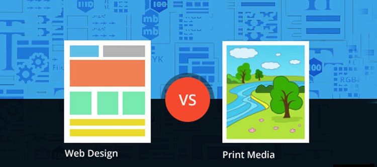
Print media and static website design differ from each other in many aspects. Let’s take a look at some factors. It’s a common concept that web and print media designing are two same things. However, professional designers have realized that these are actually very different fields and in order to deliver quality, the disparities cannot be matched.

For instance, we use small fonts on print media designs and large fonts on static website design works for visual clarity for a reader. Since font is only one aspect of design, we’ll discuss other aspects as well into detail about the differences between print media and web designing in this blog article.
Font Considerations
As mentioned above, font for the web should be visible and easy to read compared to font for print media. First consideration in web design is selection of legible font that is a lot more difficult than deciding legibility for a print design. Web designers have to take care of legibility, adoptability and licensing issues in font selection. Print designers are free from this headache – they can use any typeface without worrying about how well it will transfer onto another page.
Quality Considerations
When we talk about quality of print media and web designs, the major difference come in front of us. Print media designs are measured in dots per inch scale while web designs are measured in pixels per inch. For good quality print, print designs require minimum 300 DPI while for making attractive web designs require minimum 72 PPI as a target.
Layouts Considerations
Print media design is considered easier than web design because for print designs the sizes are fixed. You get an idea how exactly your design will look on paper. You can also get “print proof” for confirmation that your design looks exactly the way it should be. Print media designs should be perfect for being put up on almost anything of any type and size of paper.
Web designs are complicated that print media designs as they need to fit absurdly large or small screen sizes and need to be more fluid. A web designer cannot be sure that the final design will fit for web application.
User-friendly Navigation
No doubt, the toughest thing is designing for easy navigation. Reader navigation on print media design is very simple; the reader can easily get the idea in first look. Readers can also turn pages, fold, unfold, go back, switch, etc.
For web design, navigation is not so easy. Web Designers have to pay full attention to user-friendly navigation with quality pixels, breadcrumbs, menus, responsiveness and scrolling ability.
RGB and CYMK
You should know all about color palettes for both print media and web designs. If you are designing for web, you should go with RGB color palette, unlike print media designs which go well with CMYK colors. What’s more important to consider for a web designer will be the display of web page on different devices as well as how colors will be affected by HSV color model, lightness, screen brightness, contrasts and darkness. Likewise, for a print designer who considers that how color choice will appear “on print paper” as opposed to how it appears on the display screen.
Conclusion
The list above pretty much sums up the fact that designing for web and designing for the print media are having their own set of challenges and restrictions. It will be difficult for a single designer to work for both departments.


