Tag Archives: banner ad design

Effective Ways to Build a Strong Brand Identity

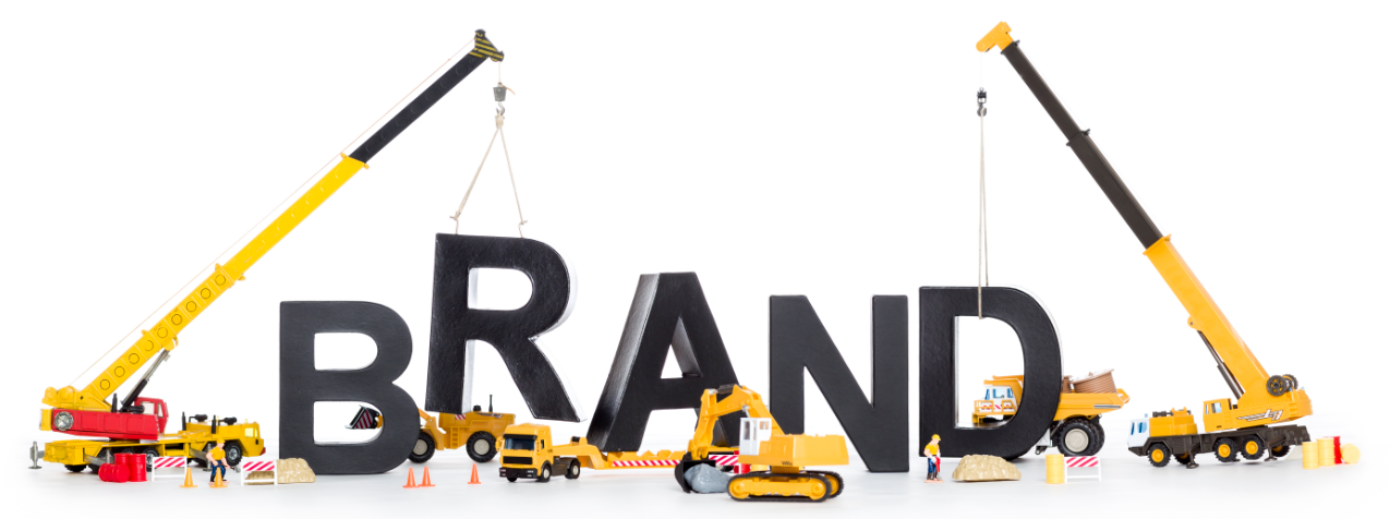
Branding is essential for every type of business, including SMBs and the big names. We are living in a world of brands and they have now become the identity of businesses. A strong brand must educate, entertain and inspire customers.

Branding is a way of defining and presenting your business to your audience. A strategically defined brand can bring a lot of for your business.

A great brand embodies a company’s core values and represents more than a product; it creates and holds an emotional connection between your customers and your brand. When customers connect emotionally and believe in your brand, it leads to loyalty and higher sales.
logo design company


Given below are a few tips to help you in building a strong brand:

Logo Design & Brand Name

A strong brand is always easily recognizable and the recognition starts with brand name and a creative logo made by some best logo design company. These two things are used everywhere for marketing, on your business cards, website, letterhead, promotional materials and social networks. In brand identity, logo is the central, identifiable key element that helps customers remember and discover a company’s brand.

Define your Brand

There are several fundamentals to help you in defining your vision and goals of your brand:

  • How is the brand perceived against competitors?
  • What is the positioning statement of your brand?
  • What benefits do you want customers to associate with your brand?
  • What is your audience? Where will the company have contact with them?

Be Noticed

  • Always remember “First impression is the last impression”. Attract people with your brand. Don’t use tatty business cards, poorly designed advert or dodgy home-made literature.
  • Link your brand with catchy taglines, images and brand benefits.

Grow Your Community

Many of the world’s top brands, including Apple, Google, Facebook, Microsoft, Amazon, Skype and Virgin, spend huge amounts on advertising and also focus on building their communities. These companies believe that if audience trusts a brand’s community, they will trust the brand.

If you are a new brand, you have many opportunities to build online and offline communities. Social media is a big platform for building communities, you can build online communities on LinkedIn, Facebook, Twitter, Instagram, or on other social networks. I’ll suggest selecting one or two platforms where you can invest your time and resources for building your community.

Deliver Quality

For building a strong brand, you need to deliver a combination of product leadership in the marketplace (like Apple), great customer services (like Virgin) and great operational services (like IKEA).

Keep Your Promises

You’d be surprised to know that many new brands fail because they fail delivering on what they promise. Happy and satisfied customers are your best referrals.

Tagged , , , , , , , , , , , , , , , , , , | Comment

10 Best Handwriting Fonts for Graphic Designers

Selection of attractive fonts during graphics design process is very crucial for every graphic designer. Fonts play a very important role in designing of an attractive and eye-catching banner or web design project.

At kooldesignmaker.com, we have designed many attractive banner designs, web designs, Facebook cover designs, YouTube cover designs and business card designs using attractive handwritten fonts.

In this blog post, I’m writing about 10 best free handwriting fonts that will help you in making your designs creative and eye-catching. These fonts are free for use in any design project.

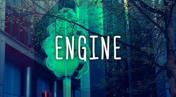
1. Engine

Engine font was created by a designer Ferdie Balderas. It is available in Regular and Italic styles and can be used in capital and lower-case letters. This font is available in four languages including English, Spanish, French and Polish.

Also, Visit [..banner ad design…]

10 Best Handwriting Fonts for Graphic Designers-engine

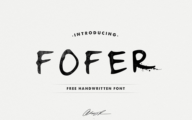
2.Fofer

Fofer font was created by Mousse Creative. Fofer gives a personal style to your designs with its natural design. It is available free for download.

10 Best Handwriting Fonts for Graphic Designers-fofer

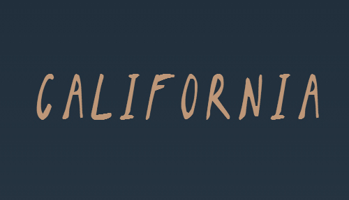
3. California Sans

California Sans is a handwriting font, created by Noe Araujo. It is an easy reading text font and mostly used for headlines. This font is available for free download, including upper and lower case letters with some special characters and numbers.

10 Best Handwriting Fonts for Graphic Designers-california

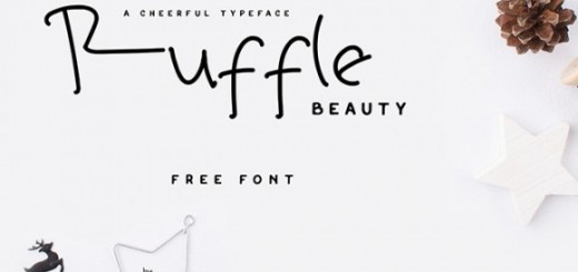
4. Ruffle Beauty

Ruffle Beauty is a fun handwriting font, developed by Anis Iday. This font is available for both personal and commercial use. It is ideal for poster designs.

10 Best Handwriting Fonts for Graphic Designers-ruffle beauty

5. Swissblnk Monthoers

Swissblnk Monthoers is a modern handwriting vintage display font type, which combines classic and modern typography styles.

10 Best Handwriting Fonts for Graphic Designers-Swissblnk Monthoers

6. Daniel

Daniel is one of my favorite handwriting fonts developed by designer Daniel Midgley. Available for personal and commercial use, can be downloaded for free. It comes with a full set of lower and upper case, special characters and numbers.

10 Best Handwriting Fonts for Graphic Designers-Daniel

7. Journal

The Journal is a free handwriting font developed by Fontourist. It supports more than 50 languages. Can be downloaded for free.

10 Best Handwriting Fonts for Graphic Designers-Journal

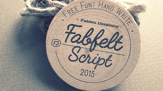
8. Fabfelt Script

Fabfelt Script was developed by a french graphic designer Fabien Despinoy. His comments about this font are “I tried to design a handwritten typeface without graininess, which is natural and a little retro”.

10 Best Handwriting Fonts for Graphic Designers-Fabfelt Script

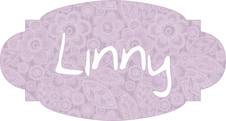
9. Linny

Linny is a handwriting font, created by Maya aka Linny. This is actually her self hand-writing style which later was developed as a font. It is now available for both personal and commercial use. It comes with a complete set of upper and lower case letters.

10 Best Handwriting Fonts for Graphic Designers-linny

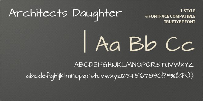
10. Architect’s Daughter

Architect’s Daughter is a font developed was Kimberly Geswein. This was actually a self hand-writing style of the daughter of an architect. It is based on the style of daily handwriting. banner ad design

10 Best Handwriting Fonts for Graphic Designers-Architect's Daughter

Tagged , , , , , , , , , , , , | Comment

How to Design Effective Display Signs and Billboards

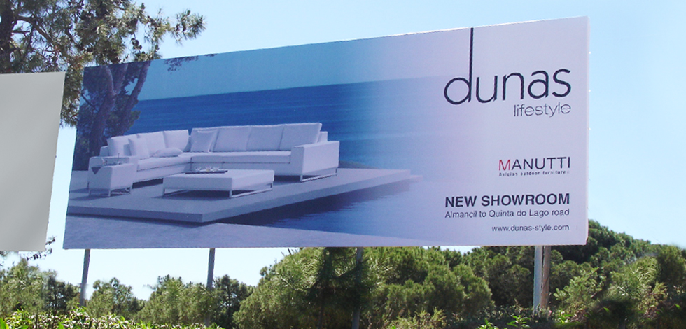
If you are a graphic designer, you should know how to design effective display signs and billboards. There are few differences in designing small banners and display signs. The major difference is scale. The display signs are a lot larger in size than the standard web banners. Other factors to focus on during designing signage are display location, typography; color scheme, contrast and material the sign will be printed on.

lodo creator company

Keeping in mind all these factors will make a better sign design.

1. Consider Size and Scale

A sign is among the largest things a graphic designer ever designs. Think of it like a big thing. A standard business card is 3.5 inches by 2 inches in size; a standard yard sign is 24 inches by 18 inches and a standard bulletin billboard is 14 feet high by 48 feet wide.

Size and scale are interesting challenges for a graphic designer. Signs have to be easily read and understood completely from a distance, often by people who only have a few seconds to look in that direction. So everything should be larger in size and simple for clear visibility.

2. Use Eye-Catching Colors and Graphics

Color is one of the most important factors that need attention when working on a sign project. You should focus on it with following two things in mind:

  • Contrast and visibility
  • Branding and identity

Generally color and graphics should be bright and saturated. Try to avoid light colors. Never use colors that have a lot of contrast, especially between the images and background.

The main purpose of signs is to catch someone’s attention in first look; you need to go big in terms of graphics and images. Also think about the location where the sign will be located. Just suppose if the sign is placed in between green tress and the theme color of your sign is also green, how visible will it really be to people?

You should plan for color scheme, keeping in mind the placement location.

3. Use Effective Contrast

The contrast is also an important part of any graphics design project, you should use such a contrast that gains someone’s attention I a couple of seconds. Every focal point should be clearly distinguishable.

There is no standard set of color combinations for display signs and contrast, given below are a few that are majorly used in signage being easy to read from a distance:

  • Red and white
  • Red and yellow
  • Green and white
  • Blue and white
  • Blue and yellow
  • Black and white
  • Black and yellow

You can create even more contrast in the sign design by adding a boarder in your design. A simple, thick black or white border encasing the sign image can help in making it more prominent from almost any other condition.

4. Consider Location

Think about the placement of the sign before designing. If you do not know the exact physical location of the signage, think about it in terms of primary placement.

You need to focus on following questions before designing:

Will the design be featured in the sky, such as a billboard?

Will the design be featured on the ground, such as a yard sign?

Will the design be featured on a moving vehicle, such as a wrap?

Will it be displayed indoors?

Do the sign have a border?

Then ask from client about the placement location of the sign. It will help you in selecting a color pattern that contrasts with the environment.

5. Use Simple Typography

When it comes to typography, keep it simple and big. Use the standard lettering in terms to 10 to 100. That means 10 inches of letter height for every 100 feet of visibility.

Do consider the total number of words. Use short and simple message. Never use a message containing more than 15 words. The standard formula used is the 3 by 5 rule. It can be defined in following two ways:

  • Five lines of text, up to three words each, or
  • Three lines of text, up to five words each

Consider using bold typography. Bold lettering helps in readability from a distance. Use spaces where required, it will minimize confusion in reading from a distance.

6. Printing Material

Printing material impacts on every decision you make in sign designing. Sign materials are often categorized into two basic categories based on location (indoor vs. outdoor). Most of the sign designs are printed on a vinyl banner, billboard, magnetic and corrugated plastic. Location of sign placement also impacts on printing material.

Ask from client about the printing material in the start of the project; get the specs, and ask about file formats. Getting detailed specs of projects at the start will save a lot of headache in the end.

Conclusion

Consider your sign design project like almost any other project, and if you are working on this kind for the first time, ask plenty of questions from the client before you get started. Sign design is not tricky; it required a high contrast, simple typography and visible to read from long distances.

Tagged , , , | Comment

Versatility Makes Your Banner Looks Great

Sometimes we just simply tired by seeing similar, old, less creative, boring banners and think how to design a banner that can really stands out of bull bag. How to make banner unique and versatile, well problem solved this article is all about making your banner versatile. Here I am going to share some simple tips that really helpful for best banner designs.

Watch New Trends:

Follow the trend. Shows people those things which they want to see.  As being a designer you just not have to be creative and imaginative you also have to aware about everything which is going on around you. For this purpose you have to see daily journals, fashion trends, latest colors what people want to wear it really helps to decide about the color combination which are trendy and people noticed. See daily news to see what is in and what is out.


Be Very Persuasive:

To make a successful banner you have to persuade you target audience that your product is the only thing that they dreamed to buy for this you must have to trigger people positively about specific product or services you are displaying in your banner, now the question is how you can do it? You can do it in many ways like you persuade your audience through your language, through your message, through images and through colors.

Experience and Expertise:

These two things can only be earn after lots and lots of practice. When you practicing something all the time, other important thing you get by this exercise is “confidence” to make things exactly right. Confidence makes you even more perfect.

Do Not Be A Follower Be An Inventor:

O yeah! There are only three kind of man in this world those who invent, those who follow and those who just copy and paste, ironically but it’s true. So while designing your banner you have to be invent something, if you follow or copy something it just simple killing for versatility.

Cut the Crap and Be Specific:

If you are going to add some words or phrase in your banner then you have to be very specific.  You just have to stick to you specific product do not be so verbose so that you audience get bored by reading it. Do not write an essay on benefits of your product in your banner try to use action verbs.

These are some simple tips that can make your banner really good and versatile.

For more details and place your banner orders click here.

Tagged , , , | Comment

Types of Web Banner Ads Design

Web banners are normally used for advertisement and they are also a source of generating traffic on your web page. They also use to separate one page from another. Flash, static and animated GIF banner ads are the three types of Static banner design. There is a lot of difference between these types which is given below.

Static Banner Ads:

Static banner ad design is stationary in nature and no moving object is used in it they are simple, straight and less flashy. Static banner ads are ideal for small business enterprises when they need to create powerful impact by not using moving objects and extra animations. They are quite simple and cost-effective in terms of online advertisements. By using catchy, bright and brilliant colors, static banner ads can cause the same impact as flash banner ads do in generating traffic on your website.


Animated GIF Ads:

Animated GIF ads are consisting of graphical an image that moves, for example, moving icons, images, text, numbers etc. They made up in GIF format and work in a specified sequence. They are rapidly used in an online advertisement. Animated GIF ads are really catchy, flashy and due to its ability to attract more and more viewers on your website they are widely used by marketers.


Flash Banner Ads:

First flash ad in the history of banners ads is created by the Macromedia. Flash banner ads are the one step ahead of animated banners. It is in a multimedia file format. Flash banner ads are more attractive than static banner ads they are quite flashy and more eye catchy. They are more complex in technology to incorporate smooth sound, animation, and interactive tool to generate more traffic on your web page and have more potential to grab viewer attention… This is the basic difference between static, GIF and flash banner ads which we mentioned above.


At Kool Design Maker you find cost-effective and compatible banner designing services at the zenith of quality standard. These are the qualities which make Go designing preferred choice of both small and large enterprises. These are some key features of our services.

•    Professional designers with years of experience in creating unique static and flash banner designs.
•    Quality assurance
•    Innovative and eye catchy designs
•    Affordable prices
•    100% satisfaction
•    Unlimited changes
•    Highest quality customer service

These are some key feature which separates us from other designing companies in the market.

Tagged , , , , , , , | 1 Comment

Keep Your Banner Ad Design Simple Yet Effective

Setting up a website is not a task that can be done with a restricted budget. You cannot just wake up one day and decide you are going to the World Wide Web. Being a professional business owner you must have an idea how important your website is. There is a lot that is not known to general people like us. So, in order to get top-notch, the perfect looking website you have to invest a handsome amount because it is an expensive yet worthy investment. Side by side, you have to make sure you assign this responsibility to the right individual. These days most professional touch to the website is given by adding banner ad design and this is indeed known to professionals only. They know how to play with it and bring the maximum business and sales for the company.

The highlighting role of the banner ad design is notified when websites are used as promotional tools to display the business existence. How can you generate traffic or gain the attention of the target market with this? Well, potential clients are first directly exposed to the ad design and later other things come across their eyes. It will act as the major eye-catching factor for those who are seeking help from the services or products offered by you. Those who know how to play with this sensitive part are actually playing with the minds of others and making money.

Now let’s have a look at the aspects which the banner ad design must have as a necessity.

•    It should be classy and stylish.
•    Your idea of the business must reflect the banner ad design you are offering. For this, you have to make sure both professional and you share the same ideas.
•    Also, it should have the quality of leaving a great impression on the client’s mind.

Continue reading

Tagged , , , , , , | Comment

11 Creative Static Banner Design Examples

Marketing via banners is the keen source of advertising and marketing your brand, products and services. At Kool Design Maker we provide high quality static web banner designs, flash banner ad design and animated GIF banner designs at possible low rates.

Here we are going to share static banner design examples:


Source:


Source:

Continue reading

Tagged , , , , , | Comment