Tag Archives: best web design

CMS Comparison Drupal Vs Joomla Vs WordPress

Development of a CMS based business website is a tricky task for any developer or Web Design Company. The web world has been flooded with a huge number of Content Management Systems. Now selection of the better one among the countless different CMS is by no means an easy job. Almost all the people working in website development field are eager to know which CMS among Drupal, Joomla and WordPress is the best?

Now, the truth is that each developer has his own faction about different CMS. Let’s have a comparison of top 3 Content Management Systems to find the best one.

CMS Comparison Drupal Vs Joomla Vs WordPress


Drupal

Drupal is similar to WordPress and Joomla in a sense that it is based on PHP-MySQL but when it comes to the popularity Drupal lies behind due to its complexity. The good thing in Drupal is its Search engine friendliness nature and the capability to handle hundreds of pages of content easily. Overall, this CMS is difficult to use for administrators.


Joomla

Joomla is certainly the most powerful CMS for eCommerce CMS development. Easy to install and very simple to use, simply install it and start your work. It has a strong administration platform along with clean and attractive front-end themes. Joomla support keeps on updating it on regular basis for advancement and fixing issues. You do not need to worry about the support, as it has a large developers’ community. The only negative point about this CMS is that it lacks SEO capabilities.


WordPress

WordPress is currently being used by almost more than 60 million websites in the world. WordPress is the easiest to use among all these Content Management Systems. It is also much more SEO friendly and stable when compared to Joomla. Just like Joomla, easy to install and manage. You can create a simple website in less than 50 clicks using WordPress.

In the end, based on the comparison, WordPress stands out as the winner because it’s the easiest, safest and more user friendly CMS. At Kool Design Maker, we can work with any of these. We are expert at Logo designing, web designing and SEO marketing.

Tagged , , , , , , , | Comment

5 Things To Consider Before Hiring An Expert Web Design Company

Having a strong online presence is not just common these days, but it has become a need to survive in online world. Business owners now look forward to have their own website and search for professional web design companies which can develop decent and attractive websites at low costs. These days, thousands of freelancers and web design companies offer such services but you need to choose the best web design company carefully.

Expert Web Design Company

Given below are 5 things which you must check before you hire a web design company.

1. Services

The portfolio of your chosen Static website design  company will let you know everything about their past work but there is still no issue in asking about the services which the company offers or specializes in. It will give you an idea, whether your chosen web design company has done the kind of project you want to offer. It is best to choose a web design company who can offer integrated services.

2. Professionalism

This is a very important factor in the successful completion of any project. Web design companies need to adopt a professional approach, should be organized and open to feedbacks and revisions. Professionalism helps in smooth functionality and tackling problems – it will also ensure that the project is completed on time.

3. Expertise

Make a thorough research on any your chosen web design company to get an idea about their experience and expertise. It will also help you to understand if your chosen company is actually capable of understanding your concepts and meeting your needs within your specified time frame and budget. Moreover, your chosen web design company should be willing to discuss every bit about the design and development process and must offer free revisions.

4. References and Reputation

Check the reputation of your selected web design company by reading the testimonials and Google business reviews before hiring. Read the feedback of past clients and ask for references. It is the best way to check out the past client’s company website or make a call to any of past clients, just to know about the reliability and reputation of the company.

5. Cost

Do not hire any static website design company without checking out the quote for your project and comparing it with other shortlisted companies offering the same kind of services. Once you have finished the price comparison, you can choose the best web design company as per your needs and budget.

Kool Design Maker is the expert Web Design Company in USA offering graphics designing, flyer designing, web design and printing services. Visit Us NOW any design or development project.

Tagged , , , , , , , , , , , , , , , , , , , | Comment

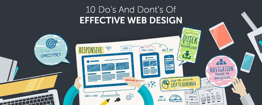
10 Do’s And Dont’s Of Effective Web Design

Everyone related with web design world must be aware that the main purpose of create a website is – SALES! All the efforts made and tools used are necessary to bring potential visitors to your website. Given below are 10 most important DO’s and Don’t s for an effective Static website design

10-Do’s-And-Dont’s-Of-Effective-Web-Design

DO’s – Good For Website Success

DON’Ts – Can Be Harmful for your business


1. Use The Best Color Scheme

Bright and loud colors are never admired for corporate websites. These are good for gaming and casino sites. Always keep in mind the mindset of your readers and their emotions – e.g., a hospital site will never have animated items and bright colors but usually has a light decent color scheme.

2. Easy Navigation

Ensure that your website is easy to navigate. Visitors are not going to spend hours in searching or locating or even trying to figure out what you want to say. Using pull quotes, images and block quotes are recommended. Html tags are also important since they focus on important sections of the web page.

3. Pages Structured

Properly manage all the pages of website. Use grid layout system which helps to store all information in structures and the format is quite easy to follow too.

4. Copywriting

Content does matter a lot. It needs to be easy to understand, to the point and meaningful. Selecting catchy headlines, attractive content and right words can be a boost to any website.

5. Focus To Important Things

Are you making a corporate website or an online shopping store? Focus and display the core items at the home page and use suitable calls to actions for inner pages. Bloggers can focus on tutorials or free e-books to get attention of visitors.

6. Placing Boxes Everywhere

Never use too many boxes everywhere. Boxes in different sizes and without any alignment can be confusing to your visitor.

7. Irrelevant Ads

Too many and irrelevant ads in any website can be really annoying for visitors. If visitors get to see irrelevant or too many ads in a website, they are surely going to leave the website to never come back again. It is a fact that everyone uses ads to make money but ads stuffing can be a real problem.

8. Writing Long Content

Never write too long content on site pages. The average content length of a page should be 500 to 1000 words. Blog articles or posts which are lengthy and without any paragraph breaks are never liked by readers. It is highly recommended to use short and crisp paragraphs with catchy headings which convey meaning easily.

9. Too Many Images

Plenty of images in your website are certainly going to make your website load slowly. Your visitors will quickly move away.

10. Keyword Stuffing

Google and your visitors don’t like your website to be too much keywords stuffed. A 500 word article with 20-30% keywords will make a poor read and your site will be penalized too by Google. Stay away from it and use only 2-3% keyword density.

Kool Design Maker is the expert Web Design Company in USA offering graphics designingflyer designing, web design, Static website design  and printing services. Visit Us NOW any design or development project.

Tagged , , , , , , , , , , , , , , , , , , , | Comment

How To Generate Quality Leads From Your WordPress Website

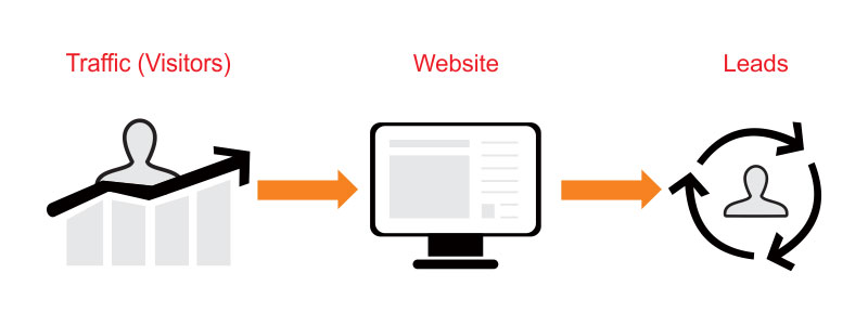
Making an online portal is just not enough to achieve goals of your business. You need quality and huge traffic on your website for making money. But the main question is, if you get visitors on your website then how will you convert them into sales? What CTAs are required and where to place them for converting visitors into sales?

The agenda is to understand that how to boost the conversion ratio of visitors into leads. If you are using a WordPress website, then it can help you.

Web Design Company

Given below are a few tips for maximizing and increasing the conversion ratio of visitors into leads for a WordPress website.


1. Use Notification Bar

Notification bar is very important for showing latest offers and news about your business. It does not mean that you use distracting pop ups when a visitor lands on your website. A notification bar means using a news ticker at the header of a website that shows latest offers. This is a great way to deliver your message and inform visitors about latest offers.

Let’s suppose a visitor lands on your website and finds a notification bar at the very first look at the header section telling about available discounts – a great way to gain attention. According to a case study, a website owner got 532% increase in leads by just simply putting a notification bar on his website.


2. Use Opt In Landing Pages

Give something special to your visitors. Provide them something extra of Sign Up. Use proper Call To Action on Landing pages and gives an e-book or something else in return of signup to visitor. You can use different CTAs for deciding which one works best.

Let’s talk about a case study, I used simple text Sign Up with sing up form that generated 19% sign ups, but when I changed the text to Sign Up for Free, the rate was increased to 46%.


3. Responsiveness and Page Speed

Most of the users now surf the web from their Smartphone and Tablets. So, fast mobile speed and mobile responsiveness has become a need for all website owners. The faster it loads the better is the user experience. You can easily check the Web Page Load Speed through Google Page Speed tool for developers.

Google is now considering mobile responsiveness as an important factor in improving search engine rankings. You have to make sure that your website is mobile friendly, so that visitors can view it properly across all devices.


4. Testimonials and Live Chat

You need to add testimonials and live chat services for a website where the user is required to make a payment for purchasing a product or service. Both these help increase the trust factor. While a live chat option can help them resolve their queries instantly and testimonials help potential customers be assured about what you’ve to offer.


5. Exit Offers

There are some websites that use exit offers. Case studies have proven them very successful. Exit Offers means that if a customer does not make any purchase on your website and clicks on exit button, then you display a pop up with hot offers before exit requesting them to reconsider.

Your WordPress site can help you to gather leads and increase conversion rate. With the availability of millions of WordPress plugins, you surely can use them for your benefits.

Kool Design Maker is the expert Web Design Company in USA offering graphics designingflyer designing, web design and printing services. Visit Us NOW any design or development project.

Tagged , , , , , , , , , , , , , , , , , , , , | Comment

2016-2017 Web Design Trends Predictions

We are in 5th month of 2016, what do you think will happen this year in web design works? We have seen a lot of developments in web design during 2015 and in the first 5 months of 2016, let’s talk about some of the hot trends that are supposed to drive the web design industry in near future. One of the main changes that we’ve seen in 2015 and 2016 is the adaptation of mobile responsive websites. I’m listing down few key trends that are likely to change the web designs in 2016-2017.

2016-web-design-trends

1. Full Width and Large Homepages

What do you think about the importance of homepages? The trend to have full-width and large home pages is going to rule the industry and single page websites are replacing the standard grid type websites. Large homepages became a trend since quite some time and the trend is supposed to continue in current and the coming years as well. Single and large home pages website have large navigation that helps in quicker analysis of website.


2. Unique Web Design Ideas

Unique web design idea are very important standing out from competitors. Websites involving unique layouts and storyboards complement the company’s image. Website owners have realized that they have to adopt unique marketing items to compete with their competitors. Thinking outside the box is very necessary these days, if you do not adopt something unique and different you will not be able to save yourself in the web design business.


3. Material Design And Flat Design

You will see an intense focus on flat design in 2016 and 2017. There will be full-width slideshows, rich loading galleries and animations as well.

As Google now prefers fast loading websites in top rankings of organic search results, more website owners will be focusing reducing the load speed time of their websites. The best method for reducing web page load time is using tiles when possible.


4. Video Marketing

Building an attractive website is just not enough. Content is the king for driving and engaging customers, but it isn’t the only one key player. Websites that have useful videos will be able to attract more visitors than normal blog posts as videos are more engaging. Embedding short videos in websites is becoming highly popular these days and it’s an effective way to deliver a message to the audience.


5. Use of Widgets

If you are using WordPress for your site, you will find thousands of widgets at WordPress website. You can show different useful widgets at the sidebar of your website that may be Facebook widget, twitter widget or recent posts widget. Widgets can significantly enhance the user experience.

Kool Design Maker is the expert Web Design Company in USA offering graphics designing, flyer designing, web design and printing services. Visit Us NOW any design or development project.

Tagged , , , , , , , , , , , , , , , , , , , , , , | Comment

Top 5 Web Hosting Companies

If you want to run your online business, it is crucial to find a good host who can put your data on the internet. A web hosting company gives you the bandwidth, storage and tools you need, and support you when you need help. There are many great hosting companies looking for your business. In this blog post, we’re going to discuss five of the best web hosting companies based on their services.

Top 5 Web Hosting Companies

InMotion Hosting

InMotion provides very fast, high performance web hosting services suitable for sites of all sizes. I highly recommend InMotion Hosting for web developers, SMBs, eCommerce sites and for WordPress. InMotion Hosting is highly popular among web developers due to their great support and for customizable unmanaged plans. InMotion Hosting is very costly – you pay a low price in exchange for unmatchable performance.

A2 Hosting

A2 Hosting is a trusted web host that offers high performance web hosting for thousands of professional businesses worldwide. A2 Hosting has the highest level of customer satisfaction between web hosting review websites & webmasters. Being more expensive than others, A2 Hosting provides more reliable web hosting and higher performance than its leading competitors. A2 Hosting is recommended for those who manage a business website and need a host that will work properly under heavy loads of traffic.

Hostgator

Hostgator leads in delivering unmatchable services to its new customers with unlimited bandwidth, unlimited disk space, an uptime guarantee, and tons of easy to install site templates, all starting at $3.96/mo for their most economical plans. Even their low-end plans feature 1-click installs, unlimited email, and a $100 Google Adwords credit for all of your online marketing needs. Hostgator is recommended for all types of sites.

BlueHost

Bluehost starts its hosting plans for new customers at $4.95/month, and offers you unlimited disk space, unlimited bandwidth, unlimited email, unlimited file transfer, a free domain registration, and more. They also offer unlimited hosted domains, e-commerce features, domain parking, one-click WordPress installs, databases, and many more.

Dreamhost

Dreamhost is one of the most popular hosts, offering shared plans starting as low as $8.95/month and dedicated server plans for customers with larger bandwidth needs. The company has a good reputation for added features for its customers, including gallery software and one-click installs for blogging that make getting your own site up and running fast and easy. Dreamhost offers you valuable feature including unlimited bandwidth, unlimited databases, unlimited email accounts, support for Google apps, and more. Customer support is available 24/7, and the company has a great money-back uptime guarantee.

Tagged , , , , , , , , , , , , , , , , | Comment

Learn From Your Competitors About Website Design

Your competitors can teach you a few things about online marketing and web design. Your competitor’s online marketing strategies and website design will make you understand what standards and expectations you are working with.

website_design

Take a closer look at following 8 tips when looking for insight from a website of a competitor.

  1. First Impression Of The Website

First impression of the website plays the main role in online selling. The design and functionality of a website are crucial in making a memorable first impression. What does the visitor see first when land on your website? Is the website customer engaging? Is the call to action used properly? What types of offers and packages are highlighted on their front-page? Get the ideas from their websites and then decide on the elements that are working fine and the ones that need improvements on your website.

  1. Mobile Responsive Website

If your competitor has a mobile responsive website, it is a sign that your competitor is up to date with latest trends. Mobile responsive websites have become a need for generating more sales from online visitors. Statistics show that customers are now surfing the internet on mobile devices and tablets. Take a deep analysis of your competitors’ websites and see how they are working with the latest trends. If they are not up-to-date, think of it as a competitive advantage.

  1. Easy To Navigate Website

Deeply examine competitor’s website and see if their navigation method is simple or complex. How many clicks are required by a visitor to acquire desired information? If visitors can easily find out what they are looking for, they are more likely to stay on the website for longer periods. The less number of clicks, the better it is.

  1. Blog

Blog is an easy way to deliver information to the visitors without interrupting them. Visitors are interested in reading the articles which are solutions of technical issues. Choose the customers engaging topics and think of writing a few posts on the same topic.

  1. Targeted Keywords

Check the organic search results against your targeted keywords into a search engine. If your competitor’s website is at top search results, they will have the understanding into which keywords have the highest searches and lowest competition. Examine the URLs structure, headings, content, image tags, and descriptions. Select the keywords that are relevant to your audience.

  1. Use Of Graphics

The use of the attractive and creative images on your website is very important. Services and products with only text look dull, images help them look attractive. Today, web-page users examine graphics, and they share them.

  1. Social Media Accounts

These days strong social presence helps a lot in online marketing. Website owners use social buttons at the header or footer of website for promotion of social pages. Check if your competitor is working on active social media accounts and try to understand their social media marketing strategy.

  1. Items Missing From Your Website

Check out the services and packages that your competitors offer on their websites. Do they offer free for download guides or any other stuff? Your competitor’s website and social media activities tell you a lot about their strategies. Compare yourself with them and try to include all missing items into your website.

If you are a business owner and want to compete with your rivals, Kool Design Maker is the perfect shop for you. We offer low price static website design and graphics design services. Call us now at 1-888-786-7861 to discuss your online business plans.

Tagged , , , , , , , , , , , , , , , , , , , , , | Comment

4 Tips to Reduce Website Bounce Rate

Bounce rate is the number of visitors who visit your website and leave from the home page without visiting any inner page – in simple words, one-page visitors. If your website’s bounce rate is high, it shows that the page wasn’t user-friendly or visitors didn’t find what they were looking for.

4 Tips to Reduce Website Bounce Rate

If your website analytics show that you are receiving high bounce rate then you need to adopt following 4 methods for reducing it:

1. Reduce Page Load Time

Slow page loading is a top factor in high bounce rate of website. If a user can’t see web content, it will increase the bounce rate. According to a survey, 47% of web users expect a page to load in less than 3 seconds.

Fast page load is very crucial for mobile responsive websites. According to a survey by Radware, a 500 milliseconds delay in page loading can result in an increase in more than 26% bounce rate.

Slow-loading pages are also a main cause of low conversion rate for e-commerce retailers. This is amazing to know that only 2% of top 100 e-commerce websites have fast mobile responsive websites that load in less than five seconds on mobile phones and tablets.

2. Make Your Content More Accessible

After fixing the mobile load time, the next step is to put useful content is proper formatting on the website. Formatting your web page content makes it easy to read for users and reduces your bounce rate. Visitors don’t read weighty paragraphs that span entire page, try to use bullet points and mention just the key points.

Given below are few points to follow for content formatting:

  • Frequent subheadings
  • Bulleted lists
  • Suitable images

Use of these content formatting ways makes your web content easy to scan for users and allows them to identify relevant points.

3. Use Sidebar Widgets and Promotions Sparingly

Use sidebar space for promoting your main packages smartly. Using excessive ads and banners in the sidebar also increases bounce rate. Try to promote relevant items in the sidebar that provides the reader additional value.

For a blogging website, try to display the relevant articles in the sidebar that will help in making your website sticky. Always provide useful and genuinely valuable content to your visitors. Similarly, if you want to display trust signals and awards in your sidebar, make sure they’re from only the most renowned and reputable sources.

Also, avoid using un-necessary pop-ups, this will frustrate visitor. No-doubt, pop-ups are highly effective, but their excessive use can be terrible, especially if you force a visitor to sign-up or watch the video in pop-up.

4. Include a Clear Call to Action

A call to action is very necessary for successful conversion of leads. You need to think about what specific action you want users to take when they’ve consumed content offered by you. Once you have decided what you want them to do, you can a crystal-clear call to action for converting leads into conversions.

Don’t confuse your visitors with multiple CTAs. Always use a single, clear and relevant call to action that helps visitors to get the job done.

Tagged , , , , , , , , , , , , , , , , , , , , , , , , , | Comment

Effective Ways to Build a Strong Brand Identity

Branding is essential for every type of business, including SMBs and the big names. We are living in a world of brands and they have now become the identity of businesses. A strong brand must educate, entertain and inspire customers.

Branding is a way of defining and presenting your business to your audience. A strategically defined brand can bring a lot of for your business.

A great brand embodies a company’s core values and represents more than a product; it creates and holds an emotional connection between your customers and your brand. When customers connect emotionally and believe in your brand, it leads to loyalty and higher sales.

logo design company


Given below are a few tips to help you in building a strong brand:

Logo Design & Brand Name

A strong brand is always easily recognizable and the recognition starts with brand name and a creative logo made by some best logo design company. These two things are used everywhere for marketing, on your business cards, website, letterhead, promotional materials and social networks. In brand identity, logo is the central, identifiable key element that helps customers remember and discover a company’s brand.

Define your Brand

There are several fundamentals to help you in defining your vision and goals of your brand:

  • How is the brand perceived against competitors?
  • What is the positioning statement of your brand?
  • What benefits do you want customers to associate with your brand?
  • What is your audience? Where will the company have contact with them?

Be Noticed

  • Always remember “First impression is the last impression”. Attract people with your brand. Don’t use tatty business cards, poorly designed advert or dodgy home-made literature.
  • Link your brand with catchy taglines, images and brand benefits.

Grow Your Community

Many of the world’s top brands, including Apple, Google, Facebook, Microsoft, Amazon, Skype and Virgin, spend huge amounts on advertising and also focus on building their communities. These companies believe that if audience trusts a brand’s community, they will trust the brand.

If you are a new brand, you have many opportunities to build online and offline communities. Social media is a big platform for building communities, you can build online communities on LinkedIn, Facebook, Twitter, Instagram, or on other social networks. I’ll suggest selecting one or two platforms where you can invest your time and resources for building your community.

Deliver Quality

For building a strong brand, you need to deliver a combination of product leadership in the marketplace (like Apple), great customer services (like Virgin) and great operational services (like IKEA).

Keep Your Promises

You’d be surprised to know that many new brands fail because they fail delivering on what they promise. Happy and satisfied customers are your best referrals.

Tagged , , , , , , , , , , , , , , , , , , | Comment

10 Best Handwriting Fonts for Graphic Designers

Selection of attractive fonts during graphics design process is very crucial for every graphic designer. Fonts play a very important role in designing of an attractive and eye-catching banner or web design project.

At kooldesignmaker.com, we have designed many attractive banner designs, web designs, Facebook cover designs, YouTube cover designs and business card designs using attractive handwritten fonts.

In this blog post, I’m writing about 10 best free handwriting fonts that will help you in making your designs creative and eye-catching. These fonts are free for use in any design project.

1. Engine

Engine font was created by a designer Ferdie Balderas. It is available in Regular and Italic styles and can be used in capital and lower-case letters. This font is available in four languages including English, Spanish, French and Polish.

Also, Visit [..banner ad design…]

10 Best Handwriting Fonts for Graphic Designers-engine

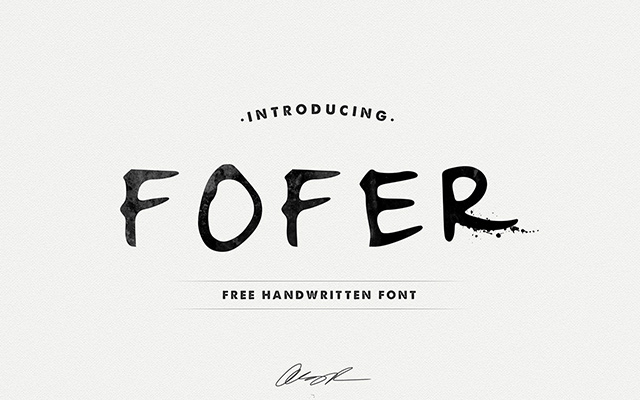
2.Fofer

Fofer font was created by Mousse Creative. Fofer gives a personal style to your designs with its natural design. It is available free for download.

10 Best Handwriting Fonts for Graphic Designers-fofer

3. California Sans

California Sans is a handwriting font, created by Noe Araujo. It is an easy reading text font and mostly used for headlines. This font is available for free download, including upper and lower case letters with some special characters and numbers.

10 Best Handwriting Fonts for Graphic Designers-california

4. Ruffle Beauty

Ruffle Beauty is a fun handwriting font, developed by Anis Iday. This font is available for both personal and commercial use. It is ideal for poster designs.

10 Best Handwriting Fonts for Graphic Designers-ruffle beauty

5. Swissblnk Monthoers

Swissblnk Monthoers is a modern handwriting vintage display font type, which combines classic and modern typography styles.

10 Best Handwriting Fonts for Graphic Designers-Swissblnk Monthoers

6. Daniel

Daniel is one of my favorite handwriting fonts developed by designer Daniel Midgley. Available for personal and commercial use, can be downloaded for free. It comes with a full set of lower and upper case, special characters and numbers.

10 Best Handwriting Fonts for Graphic Designers-Daniel

7. Journal

The Journal is a free handwriting font developed by Fontourist. It supports more than 50 languages. Can be downloaded for free.

10 Best Handwriting Fonts for Graphic Designers-Journal

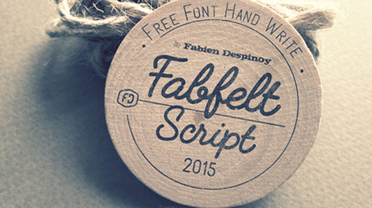
8. Fabfelt Script

Fabfelt Script was developed by a french graphic designer Fabien Despinoy. His comments about this font are “I tried to design a handwritten typeface without graininess, which is natural and a little retro”.

10 Best Handwriting Fonts for Graphic Designers-Fabfelt Script

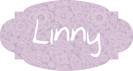
9. Linny

Linny is a handwriting font, created by Maya aka Linny. This is actually her self hand-writing style which later was developed as a font. It is now available for both personal and commercial use. It comes with a complete set of upper and lower case letters.

10 Best Handwriting Fonts for Graphic Designers-linny

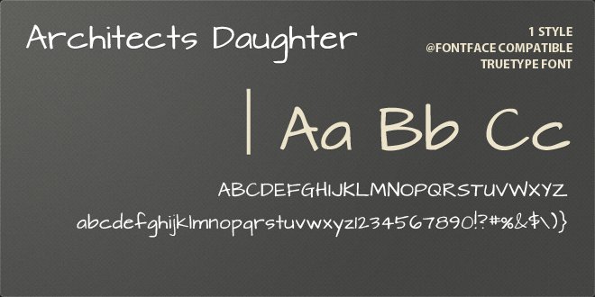
10. Architect’s Daughter

Architect’s Daughter is a font developed was Kimberly Geswein. This was actually a self hand-writing style of the daughter of an architect. It is based on the style of daily handwriting. banner ad design

10 Best Handwriting Fonts for Graphic Designers-Architect's Daughter

Tagged , , , , , , , , , , , , | Comment